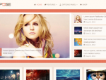
20 of the Best Mobile WordPress Themes

What are the Best Mobile WordPress Themes? You might ask. Today we present a collection of some top of the line, high quality and best rated WordPress Mobile Themes. These mobile friendly responsive WordPress Themes are ideal for any type of website or blog you can think of.
Trends are changing, now more and more people use the internet on their phones and tablets. So it has become extremely important that you optimize your website or blog for mobile devices. A responsive theme automatically adapts its layout according to the screen size or device which is being used to view your site.
It doesn’t matter if the visitor is on a PC, a laptop, tablet or a smartphone, the Responsive WordPress Theme will optimize itself automatically to provide the best reading and browsing experience to the user.
These WordPress Themes for Mobile are all responsive, SEO friendly, easy to install and use, and most importantly they are easy to maintain. In short, your website or blog will be optimized fully to cater any type of device or screen size. So let’s look at the top responsive wordpress themes…
Best WordPress Themes for Mobile/Handheld Devices
Breezy – A Lightweight Mobile Theme for WordPress

Breezy is a very clean and lightweight WordPress mobile theme. Designed to be used on a brand new WordPress installation or set up as a secondary, mobile-only theme for your existing WordPress site, Breezy comes with a completely customizable menu system and loading screen.
On top of that, you can also quickly change elements like title and body font sizes, line heights, colors, and alignment. And while primarily intended for use on smartphones and tablets, you’ll find it also works great on desktop.
Jackdaw – WordPress Mobile Theme
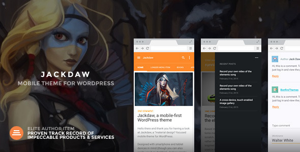
Designed with smartphone and tablet devices in mind (though you can also easily use it on desktop), Jackdaw can be used on a brand new WordPress installation or set up as a secondary, mobile-only theme for your existing WordPress site.
It’s a fast and lightweight theme that – thanks to its extremely clean design, customizability of the menu and header, as well as beautiful animations – stands out on the WordPress mobile theme market.
Rogue: Customizable Mobile Theme for WordPress

Designed with smartphone and tablet devices in mind, Rogue can be used on a brand new WordPress installation or set up as a secondary, mobile-only theme on your existing WordPress site.
Like Bonfire’s previous mobile offerings, Rogue is super easy to set up and use. Now, however, you can also heavily customize the theme’s appearance.
Aura Premium Mobile Theme
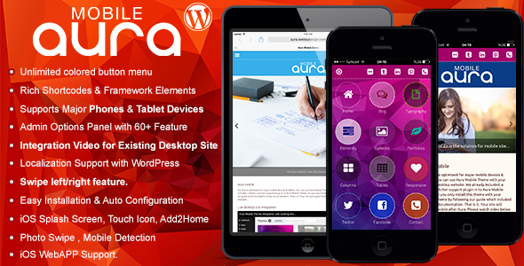 AURA Mobile Theme is created with full customizable theme system. While coding this template we try to give you better mobile experience. Aura have perfect mobile blog system with post format support. Also custom portfolio, gallery, video and Sound Cloud supports. You can insert unlimited category and menu item in Aura Mobile Theme. Our mobile theme is support image icons & font icons with unlimited color variations. You can use mobile retina icons which we already included with FontAwesome & 370 image icons.
Vibrant: A Super Sharp WordPress Theme

Vibrant is super clean, light and was built with minimalism in mind. That said, the theme’s stand-out elements like the unique menu display, comment form and per-post/page custom header colors ensure it doesn’t look generic and is immediately memorable to the user.
Vibrant can also serve many purposes. Use it for a simple blog, a mobile home for your business, to show off your portfolio, etc. It can also be used as a secondary, mobile-only theme on your existing WordPress installation or set up as the main theme on a brand new installation. You can even use it for a full-blown desktop site if you so choose.
Monolith – WP theme for bloggers and professionals
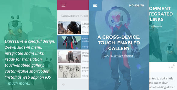
Monolith is perhaps Bonfire Themes’ most expressive mobile theme to date. With in-your-face imagery, the theme is an immediate standout from the crowd and is especially suitable for anyone looking to present their content, products and/or services through memorable and strong visuals.
As is the case with all our previous themes, Monolith too can be used for many purposes; whether you’re a straight-up blogger, need to show off your work, and/or advertise your services, Monolith can be a trusty partner that can be used as a secondary, mobile-only theme on your existing WordPress installation or set up as the main theme on a brand new installation.
Also included is a uniquely ‘swappable’ comment form, a validation-enabled contact form, highly customizable shortcodes, etc.
Bean Premium Mobile Theme
 Bean Mobile Theme is created with full customizable theme system. While coding this template we try to give you better mobile experience. Bean have perfect mobile blog system with post format support. Also custom portfolio, gallery, video and Sound Cloud supports. You can insert unlimited category and menu item in Bean Mobile Theme. Our mobile theme is support two menu (Top Slide Menu & Right/Left Menu). You can use mobile retina icons which we already included.
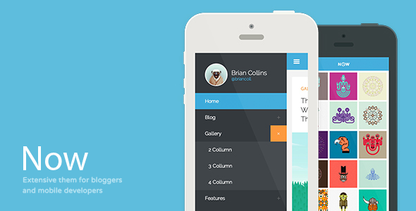
Now – Extensive WP Theme For Bloggers & Developers
 Features:
- Fully functional Contact form with inline validation
- 400 Different Color Combinations & Unlimited with custom color picker
- Optimized for new iOS 7, Android and Windows Phone
- 7 Different Post formats (Soundcloud support)
- Over 16 Fully customizable shortcodes
- Compatible with desktop themes using device switcher plugin
- Rich Theme Options
- Touch gestures support (just swipe from left to right to open the menu)
- All images optimized for the best performance & speed
- CSS3 Hardware accelerated animations with proper fallback
- True Touch input support (Hover & Click states without delay)
- Mobile WebApp Support (Icons & Splashscreens)
- Responsive Tables, Pricing Tables
- Progress Bars, Alert Boxes, Panels, Buttons
- Rich Typography
- 6 Different Post formats
- Many Page Templates
- Gallery page templates
- Documentation Included
- Liquid Layout
- Valid Code
Gamma – Mobile Retina | HTML5 and CSS3 WordPress

Gamma is crystal-clear mobile template. It has pure typography and blogging spirit. If you like modern and clean flat design look no further.
Gamma WordPress Theme can work alongside your WordPress desktop theme
Writter – A Modern Grid Based Mobile Theme

Writter is grid based minimalistic theme with buch of colorful features bloggers will appreciate. Clean and smooth modern design with 8 great post formats is the right choise. Theme was built with strong focus on typography. On the mobile screen it’s just the best looking theme our there.
Writter is the right choise for creative bloggers but not only for them. Post layout can be used as a portfolio. It’s all about creativity.
DuoDrawer Mobile Retina | WordPress Version

Klassio RSV | Responsive WordPress Mobile Template

Klassio RSV template is crisp, clean and adaptable, and is beautifully responsive. Built with HTML5 and CSS3, powered by affection and care, leveraging technology and user interface best-practices, the Klassio RSV template is loaded with various kinds of pages and options to give your website the edge it needs.
This template is carefully handcrafted with stress on content and typography, while implementing some of the industry-standard and intuitive user interface concepts. Very quick to customize and set up, compatibility with an array of mobility devices like smartphones and tablets – the Klassio RSV template is a well-thought decision that you could make.
HUNTER – A clean & classy WordPress theme
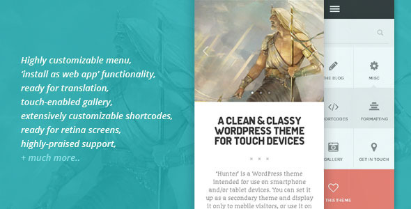
‘Hunter’ is a WordPress theme intended for use on smartphone and/or tablet devices. You can set it up as a secondary theme and display it only to mobile visitors, or use it on a brand new installation; whichever suits your situation.
With plenty of features in tow, ‘Hunter’ can be used for many purposes; set up a straightforward blog, include an optional static front page, build portfolios and a touch-enabled galleries etc. Also included is an utterly unique comment form along with a validation-enabled contact form, ‘install as web app’ functionality on iOS, plus sliders, shortcodes and so on.
TOUCH: A Lighter-than-air WordPress Mobile Theme
‘Touch’ is the 4th in a series of mobile WordPress themes from Bonfire Themes and is intended for use on smartphone and/or tablet devices. Set it up as a secondary theme and display it only to mobile visitors, or set up a brand new WordPress installation; the choice is yours.
‘Touch’ may look light and airy but, as can be seen on the features list below, it’s a mobile theme with plenty of features in tow and can be used for many purposes; set up a straightforward blog, an optional static front page, a touch gesture-enabled gallery, or even a portfolio. Also included is a utterly unique comment form along with a validation-enabled contact form, plus sliders, shortcodes, ‘install as web app’ functionality and so on, and so on.
Resans – Mobile and Tablet | WordPress Retina

Resans is highly advanced WordPress theme. It’s based on many plugins which provides excellent sight. Resans comes with 50$ worth plugins. Provides such abilities such as infinite scrolling, page preloading, loading animations and highly advanced administration panel.
Resans is fully responsive, retina ready WordPress template. You may use it alongside your desktop template and set it up with Resans AP. There’s online help guide to tell you basics (here) or ticket support.
HERO: A No-Nonsense Mobile WordPress Theme
 This theme is designed to be super simple to use, yet provide loads of functionality. Do visit the live preview and read through this page to get a more comprehensive overview of what the theme has to offer, but here are just a few quick highlights:
- works alongside your desktop site
- ready for localization
- ‘install as web app’ on iOS
- beautifully unique menu, comment/contact forms
- touch/swipe gallery
- multiple color schemes
- a variety of extremely customizable shortcodes
- comprehensive documentation
Provocateur° Mobile WordPress Theme

Provocateur° is template build in jQuery Mobile, HTML5 and CSS3 developed for mobile devices. Optimized for Apple devices.
Moby Elite – WordPress Mobile Theme

Moby – Elite is a Mobile WordPress Business Template written in HTML5 with clean code and structure, which can be customized very easily according to your business needs.
Features: Theme Options Panel Supports All major phones & tablets Flexi Touch Slider Contact Form 5 Color Schemes HTML5 Validated Accordion Files in Moby package 25 Fully commented HTML pages 5 Fully layered PSD Files Documentation.
Spartan: A Fully-featured theme for Mobile+Tablets
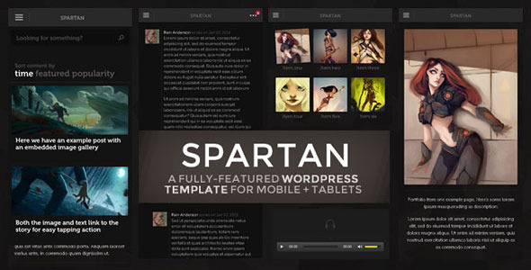
The goal with SPARTAN was to create a fully-loaded theme that would serve as the mobile and tablet home for any and all types of WordPress sites while also being a great stand-alone theme. With its color scheme suitable for all businesses, organizations, as well as personal sites, the theme allows your content to take center stage.
It’s the little things that we think are so great. Like the menu that goes beyond just listing a number of links in predetermined styles, allowing you to instead build and color a unique navigation system. Or the comment button also serving as a visual indicator; grayed out when comments for a given post are disabled, or shaking itself ever so gently to remind the user to read and leave comments when comments are enabled. Or the amount of customization available for shortcodes. It’s your call how deep you want to go.
Mobit Premium Modern Mobile Theme
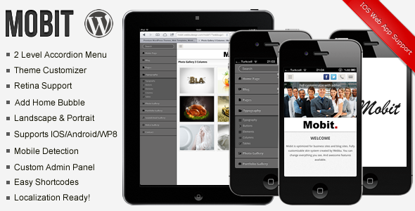
Mobit Mobile Theme is optimized for phones and created with full customizable system.
And while coding this template we try to give you better mobile experience. Mobit have perfect blog system. Also custom portfolio, gallery, video and Sound Cloud listing pages. You can insert unlimited category and menu item in Mobit Mobile Template.